List of Squarespace Data Section Themes
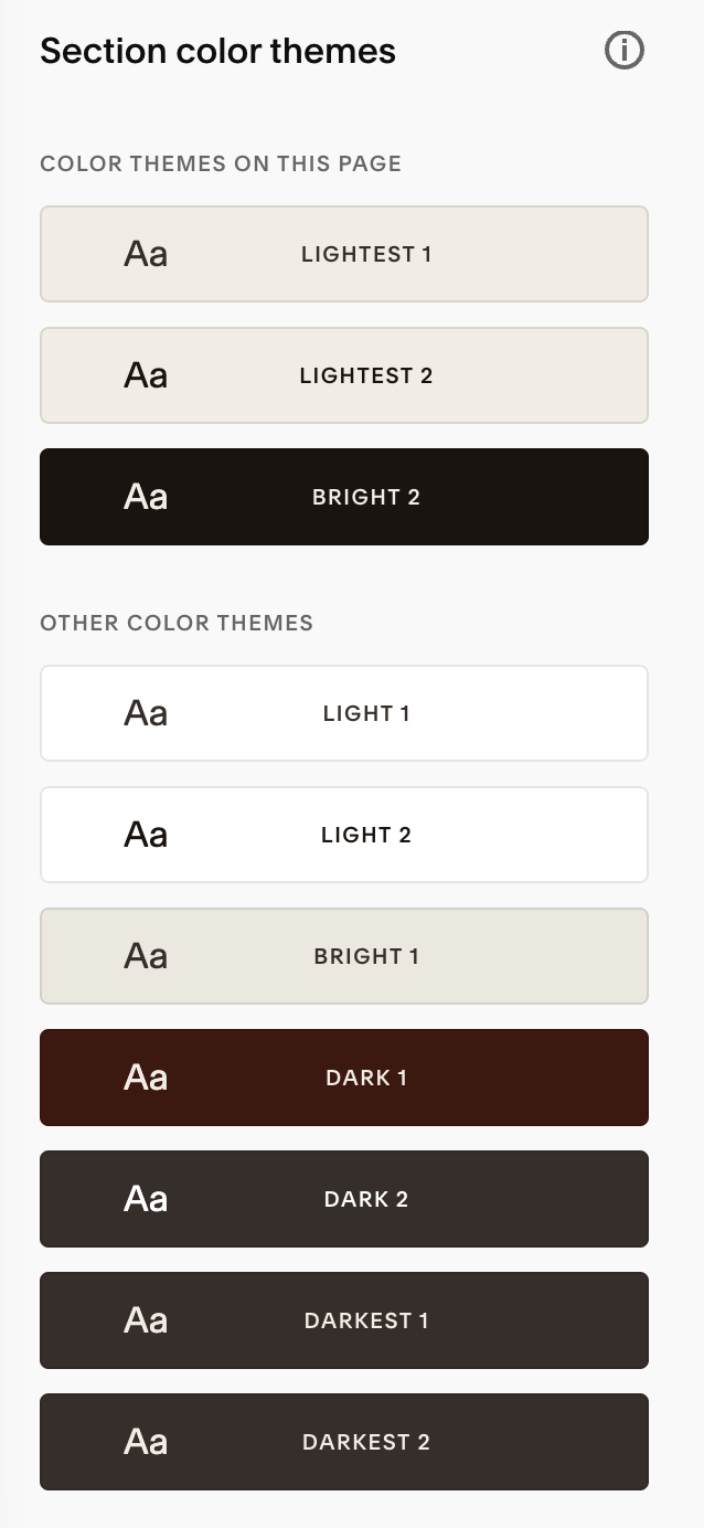
Squarespace uses a variety of data section themes, including light and dark variants, to control the visual appearance of different sections on a webpage. These themes are used to style elements like text, backgrounds, and dividers.
Specifically, you can use themes below to customise your sections:
 .bright-inverse
 .light-bold
 .light
 .white-bold
 .white
 .black-bold
 .black
 .dark-bold
 .dark
 .bright
Detailed Breakdown:
Light Color Sections:
These themes create a visually lighter appearance, often using white or light-colored backgrounds and darker text. Examples include .bright-inverse, .light-bold, .light, .white-bold, and .white.
Dark Color Sections:
These themes provide a more contrasting look, typically with dark backgrounds and lighter text. Examples include .black-bold, .black, .dark-bold, .dark, and .bright.
Using Data Attributes:
You can identify the theme of a section by inspecting the HTML source code of the page and looking for the data-section-theme attribute. For instance, you might find data-section-theme="light".
Styling with CSS:
You can use the data-section-theme attribute in CSS to target and style specific sections. For example, you can use section[data-section-theme="light"] to target all sections with the "light" theme.
Example code: Changing Your Logo per Data Section Theme
Invert your logo to black on a light background theme:
[data-section-theme="white"] {.header-title-logo img {

    -webkit-filter: grayscale(1) invert(1);

    filter: grayscale(1) invert(1);

}

}
Invert your logo to white on a dark background theme:
[data-section-theme="dark"] {.header-title-logo img {

    -webkit-filter: grayscale(0) invert(0);

    filter: grayscale(0) invert(0);

}

}