Cavallo Real Estate Branding
services:
Custom Branding Design
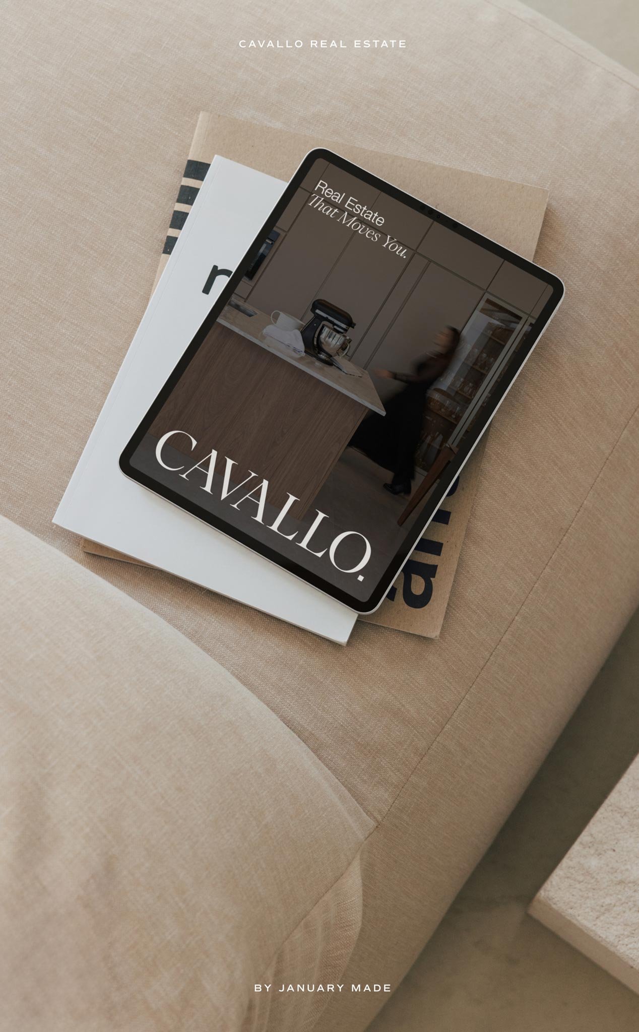
There is something extra special about getting to build a brand I’ll actually see out in my own neighbourhood. Cavallo Real Estate is based here in Selwyn, Christichurch, working across Rolleston, Springston, West Melton and the surrounding areas, so from the beginning I was excited by the opportunity to create an identity that could bring something distinctive to the local property market.
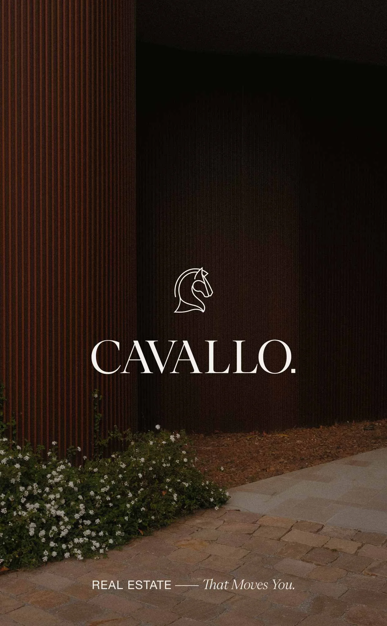
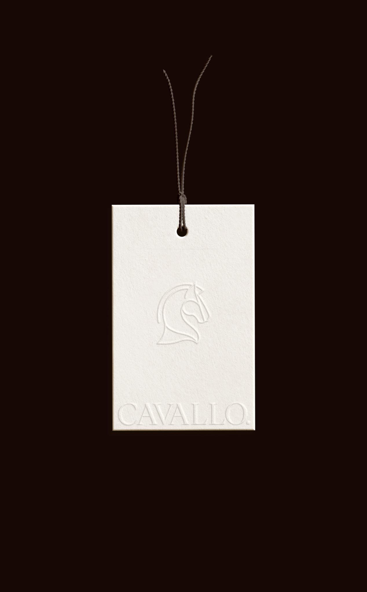
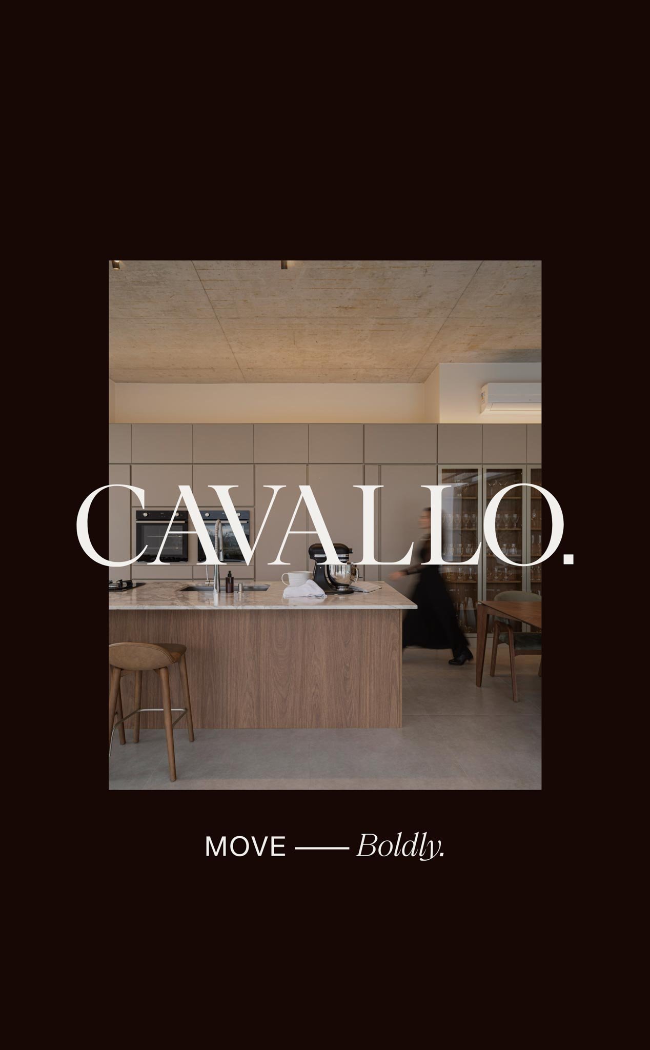
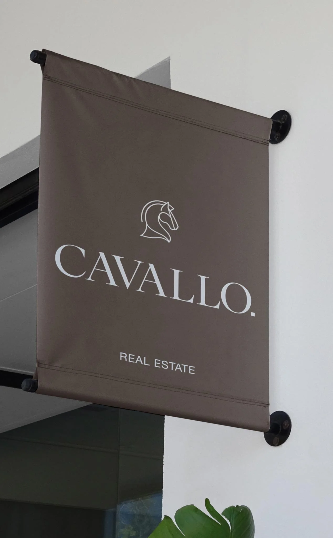
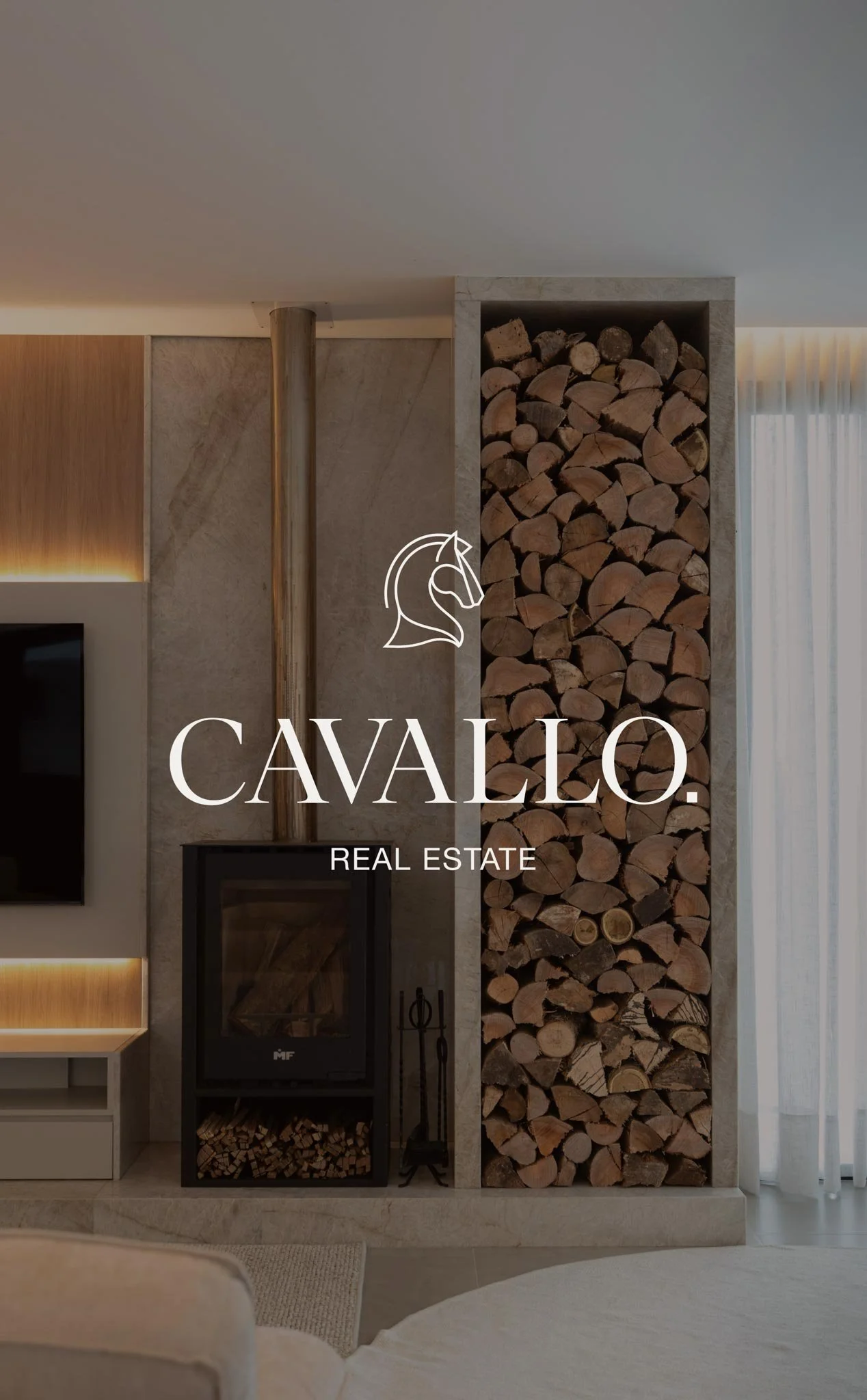
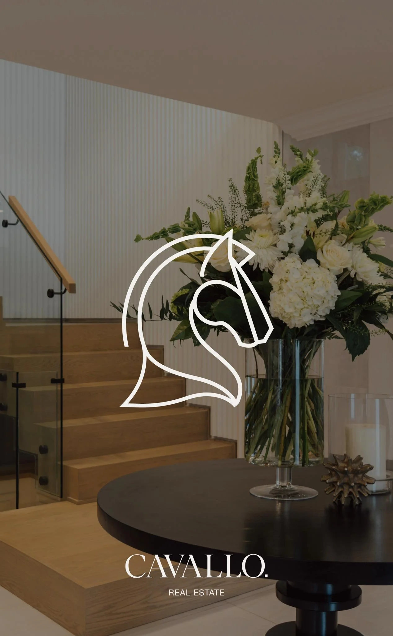
Cavallo takes its name from the Italian word for horse, and that gave me a strong starting point without needing to turn the brand into an obvious equestrian identity. The horse became a quieter reference to strength, movement, trust and legacy, all qualities that reflected the way Rachael wanted Cavallo to approach real estate. The wider brief was refined, precise and calmly confident, with an editorial quality that could appeal to everyone from first-home buyers with an eye for design through to lifestyle movers, established homeowners and prestige investors.
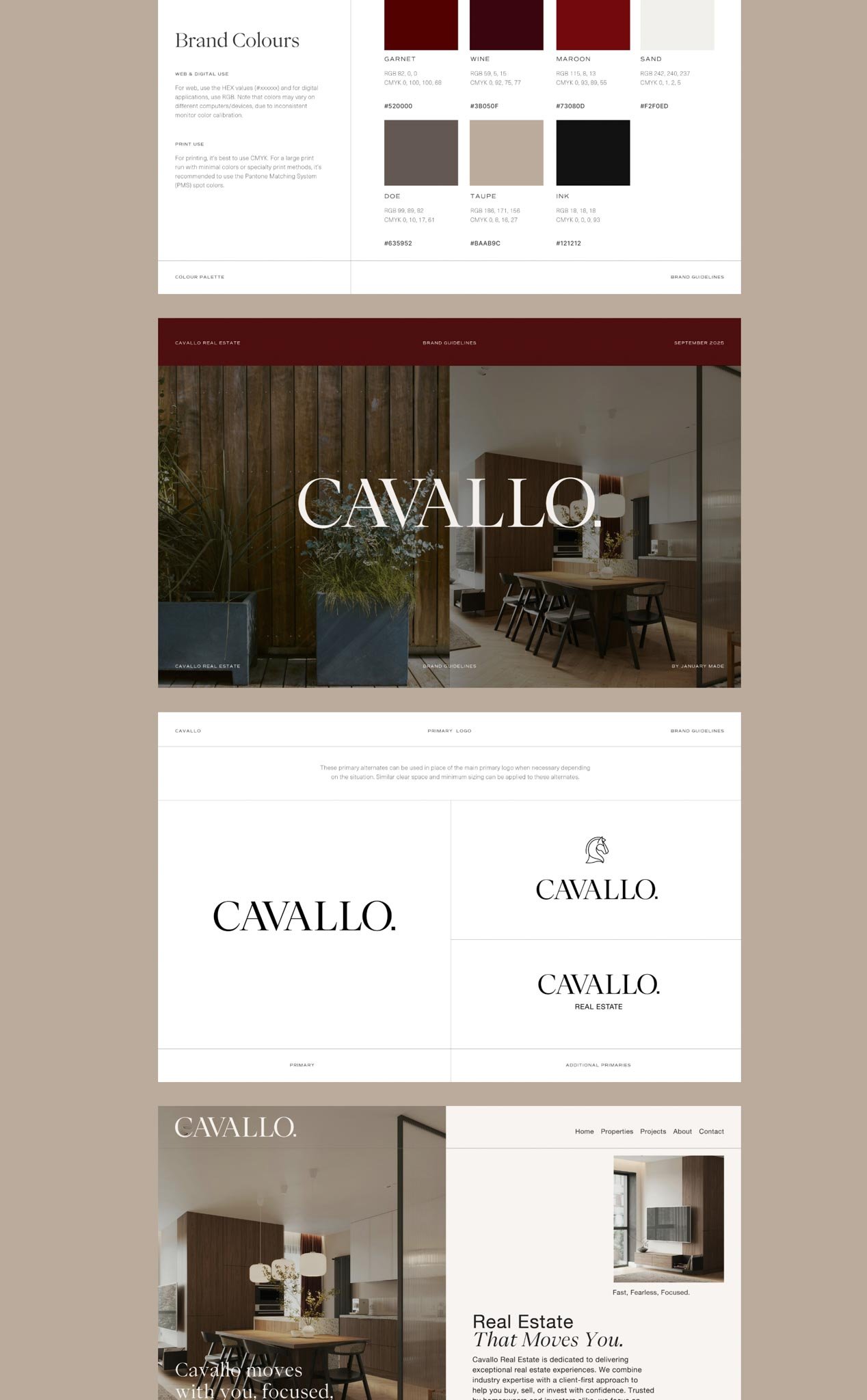
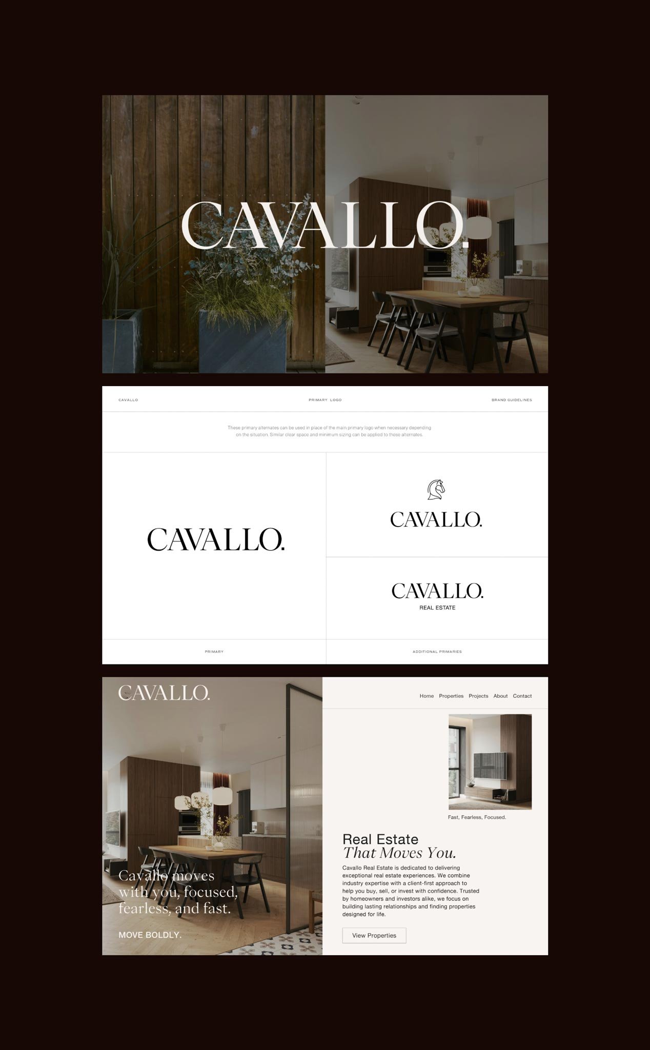
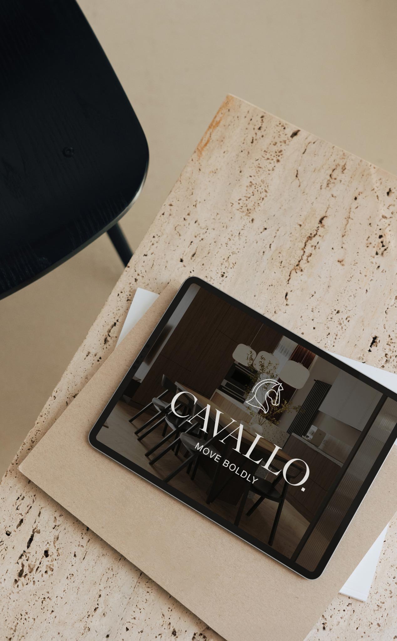
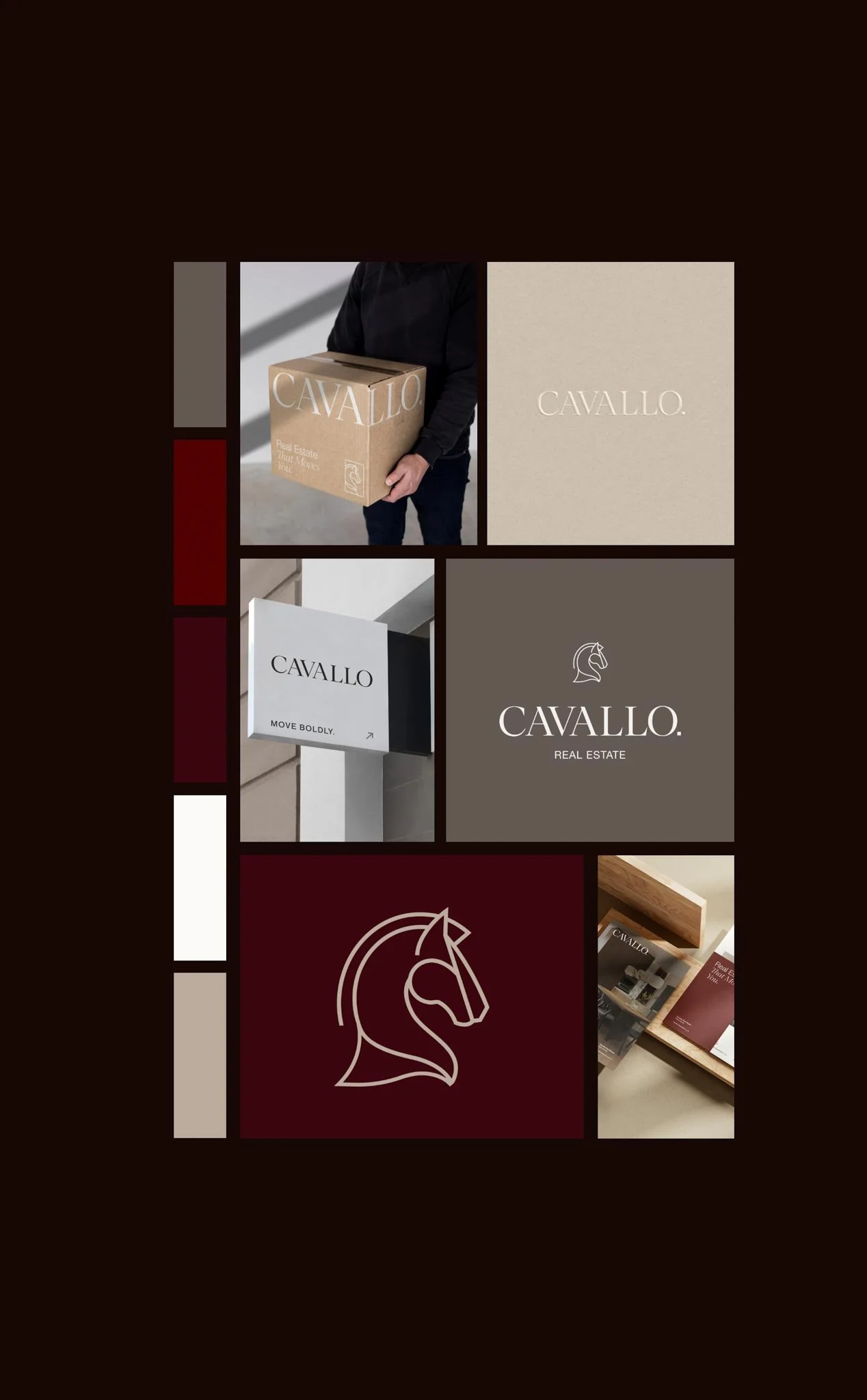
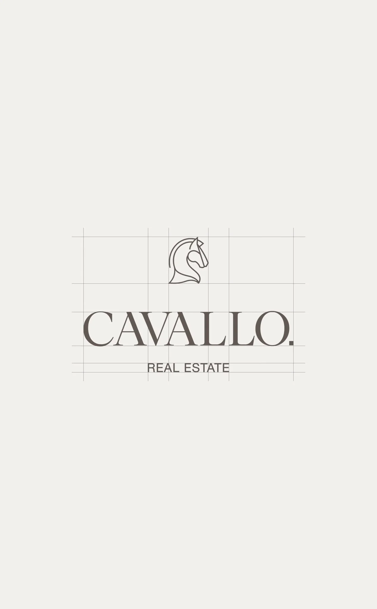
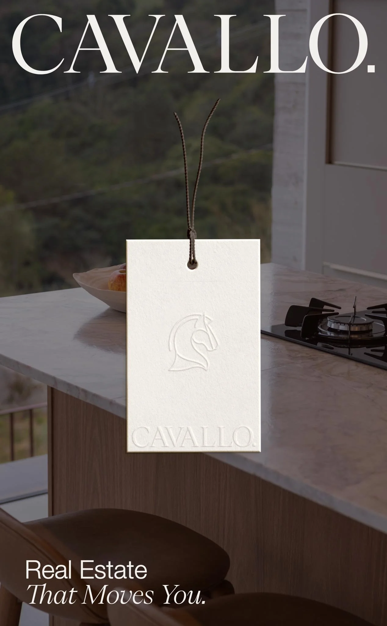
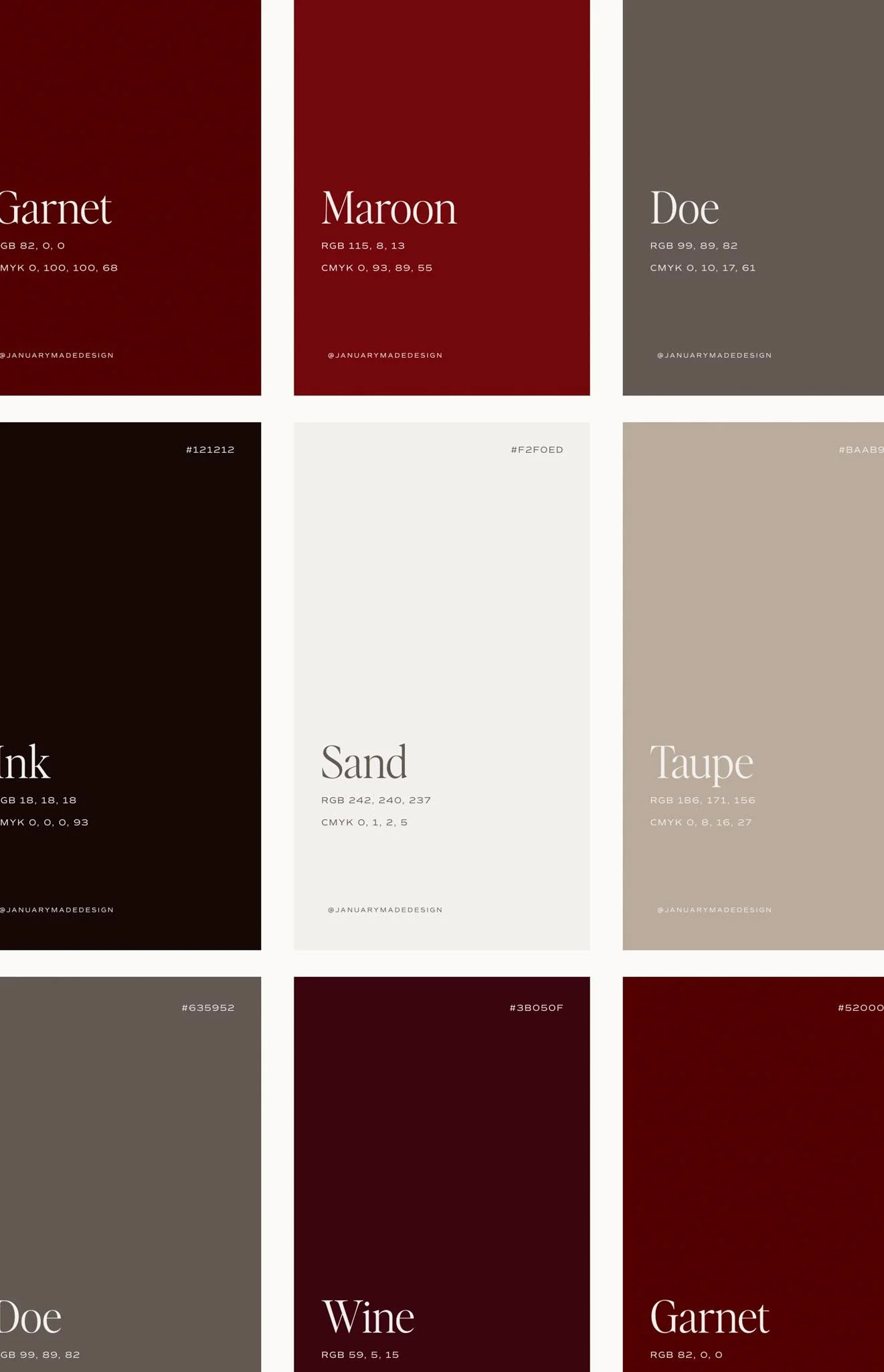
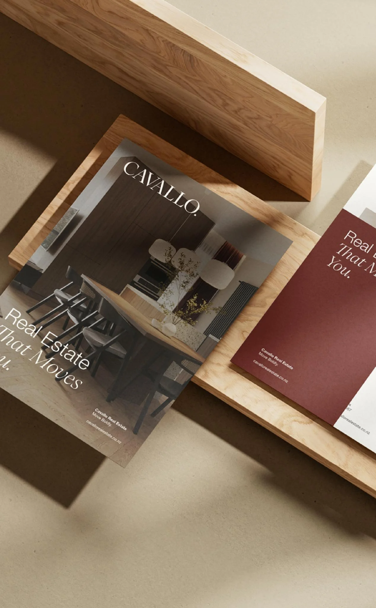
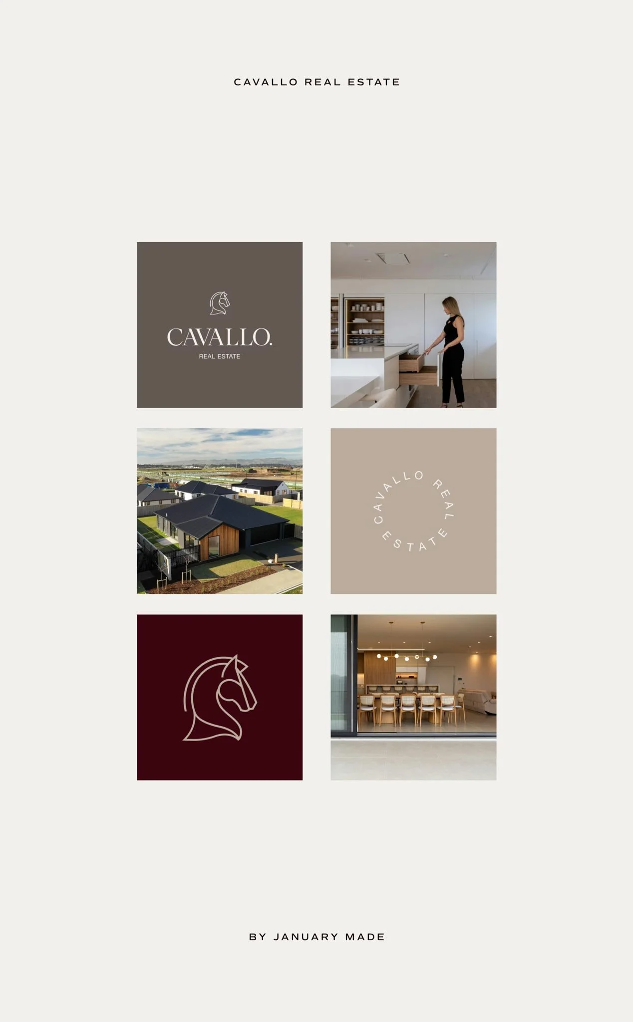
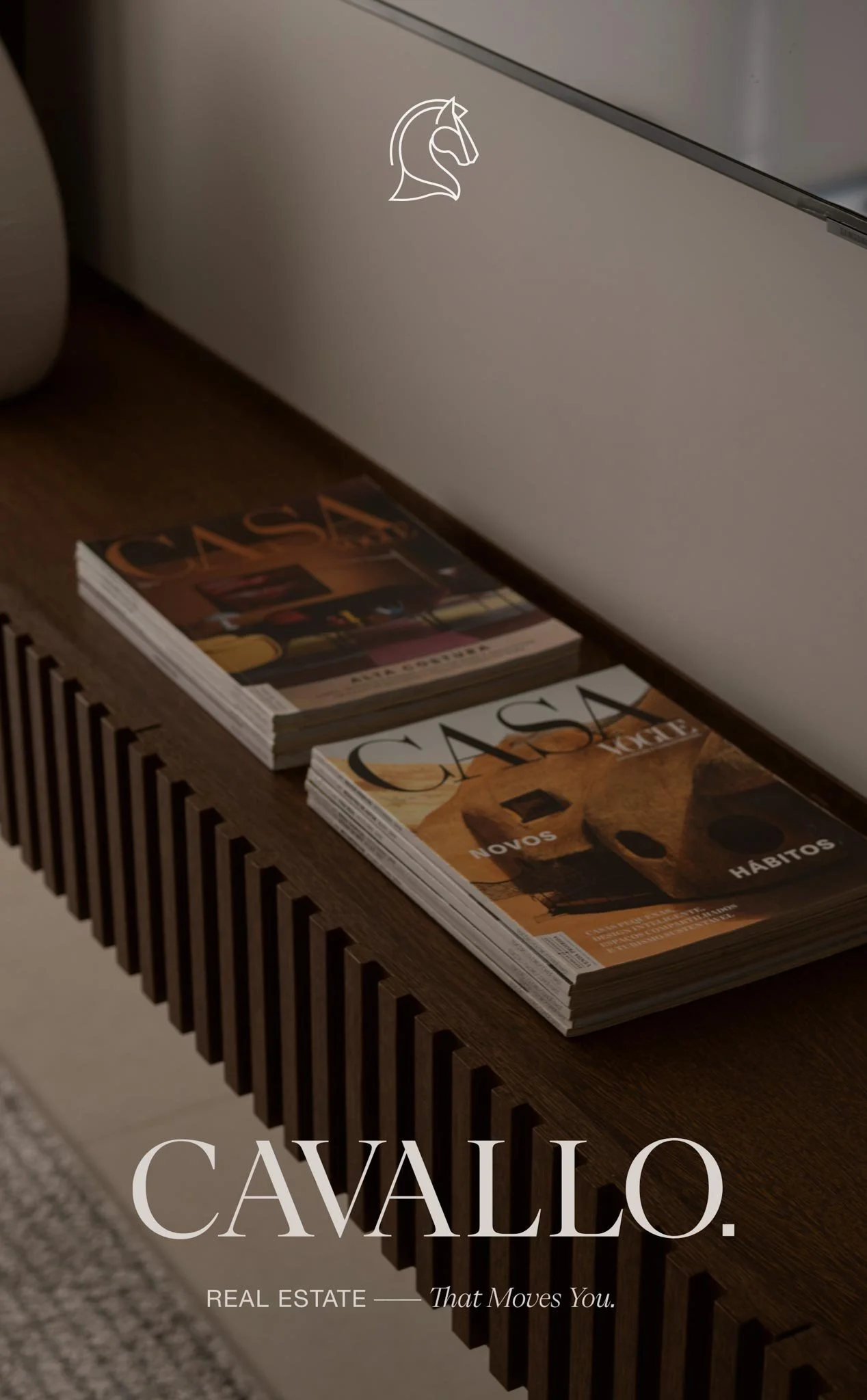
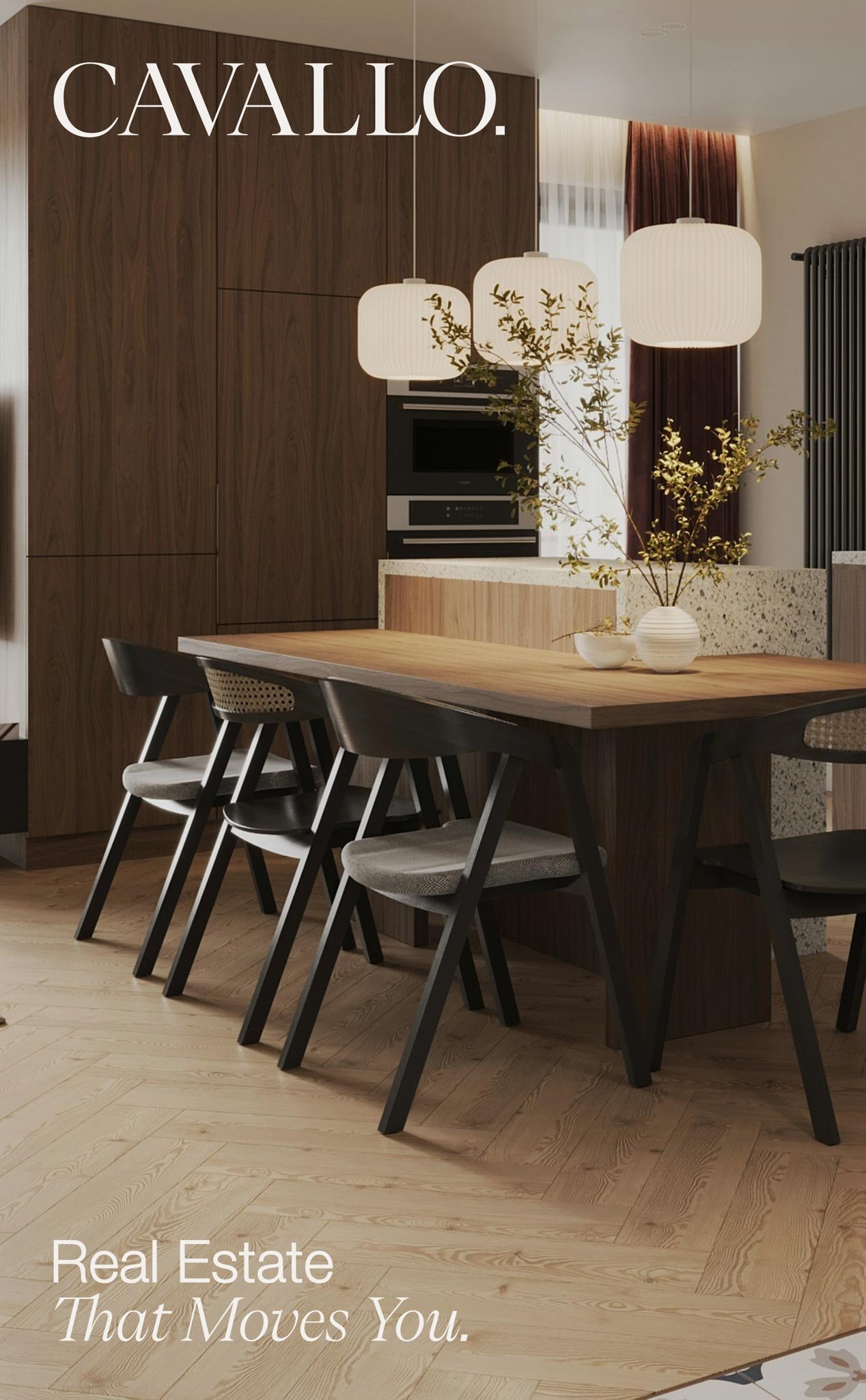
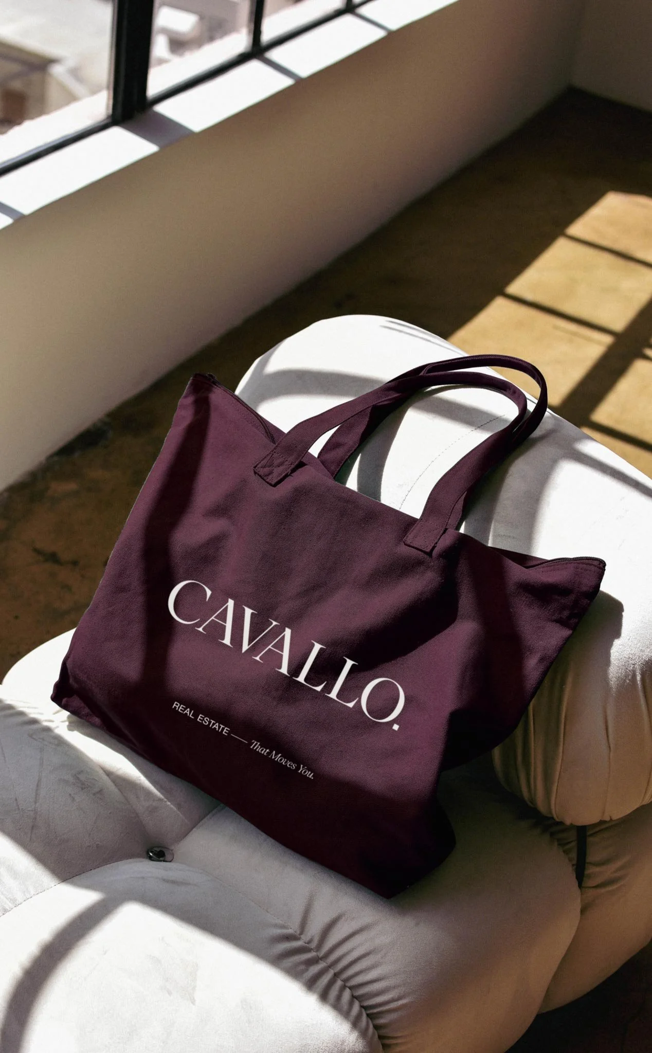
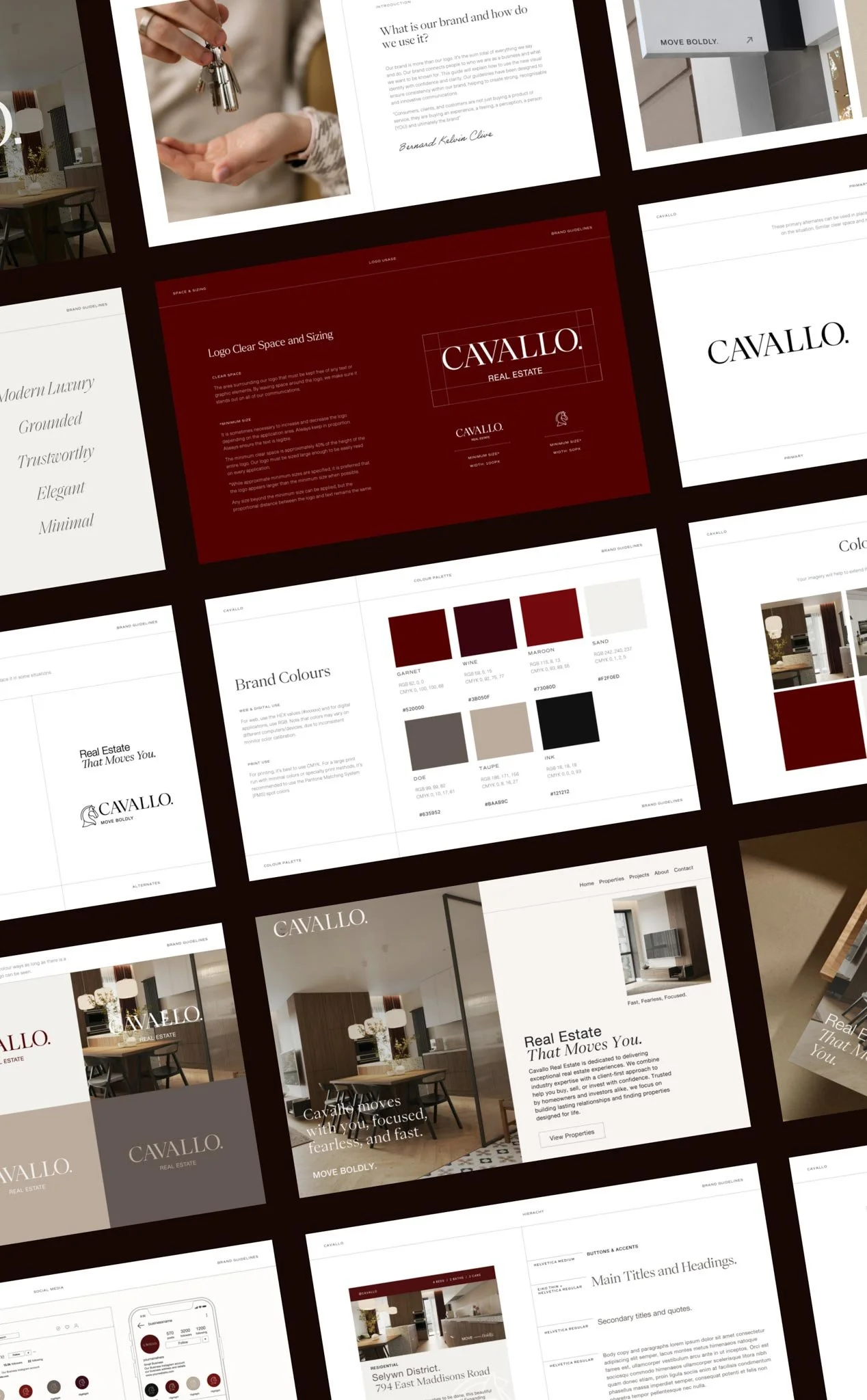
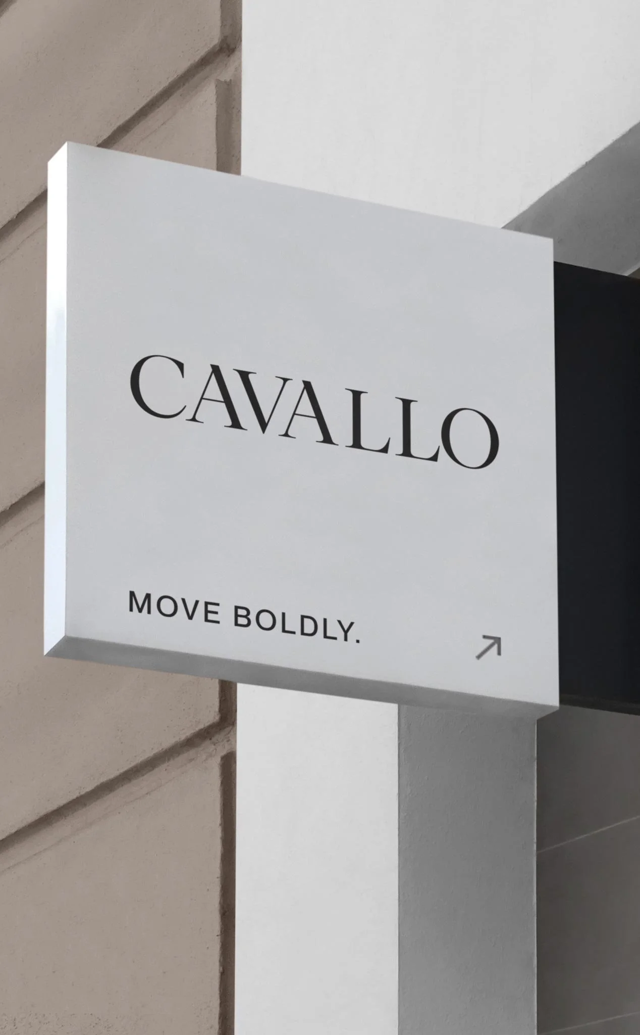
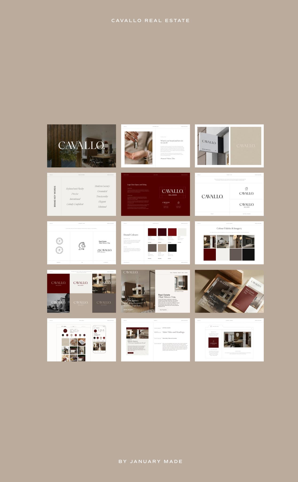
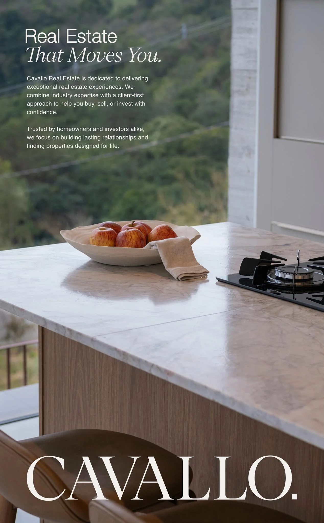
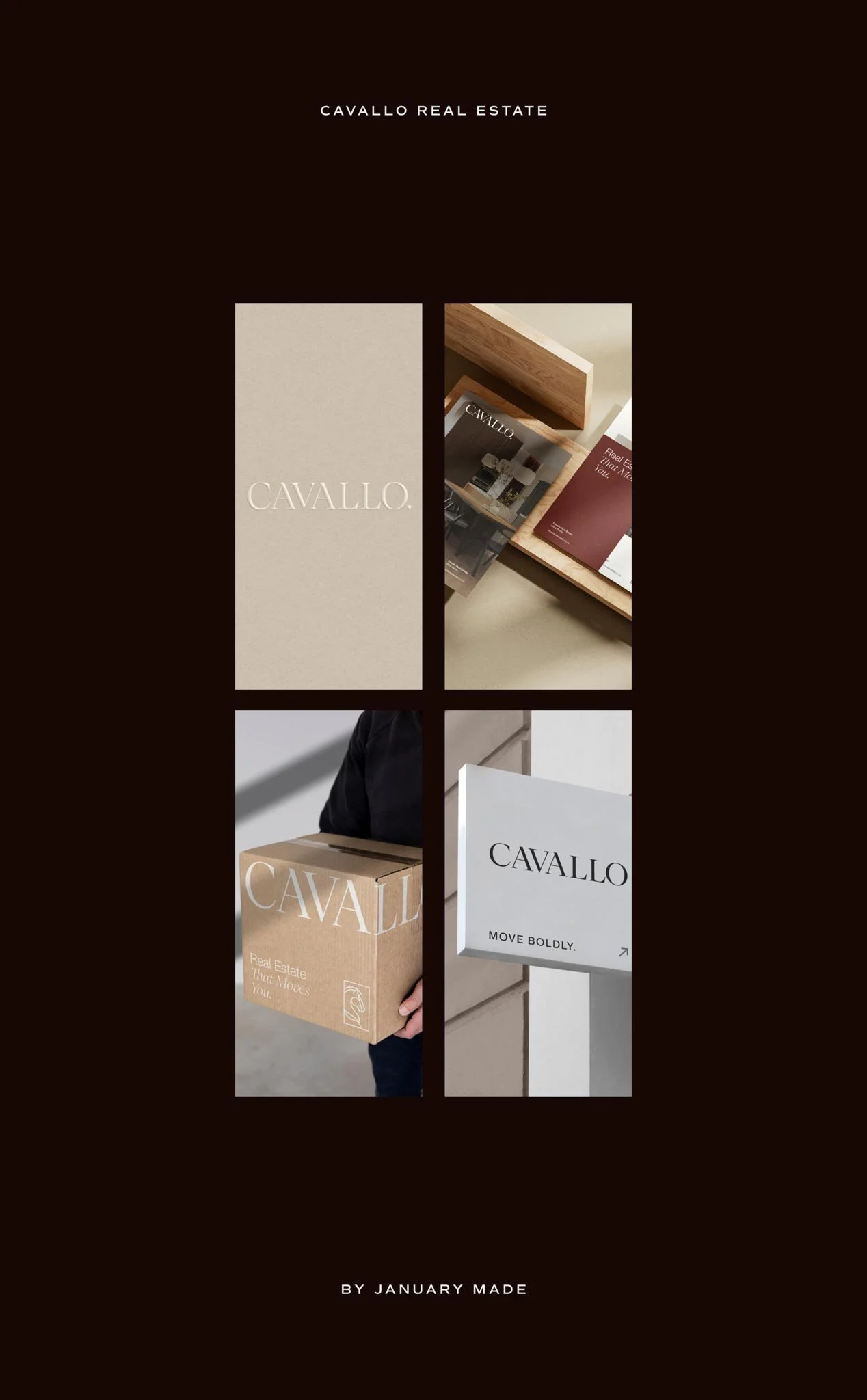
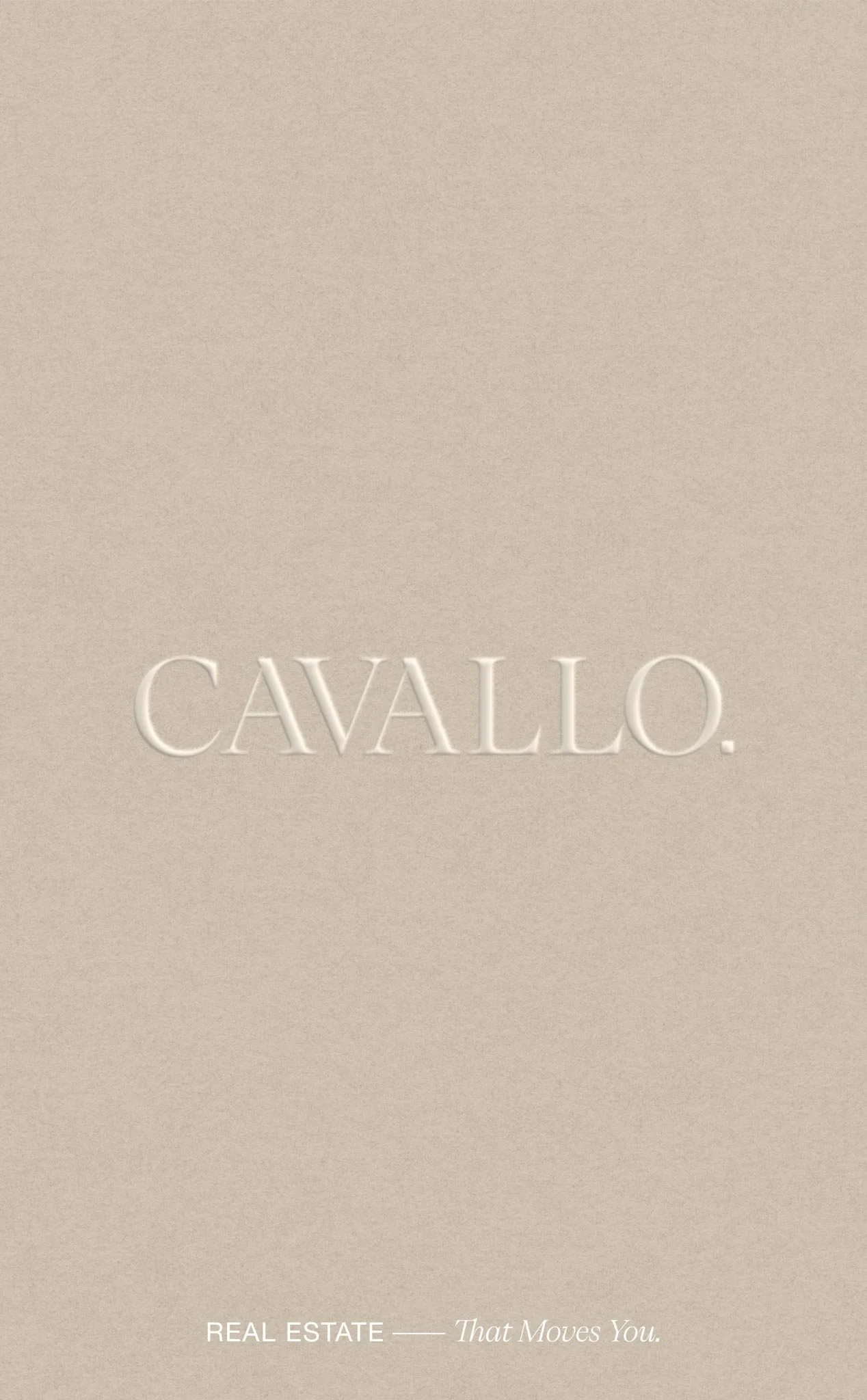
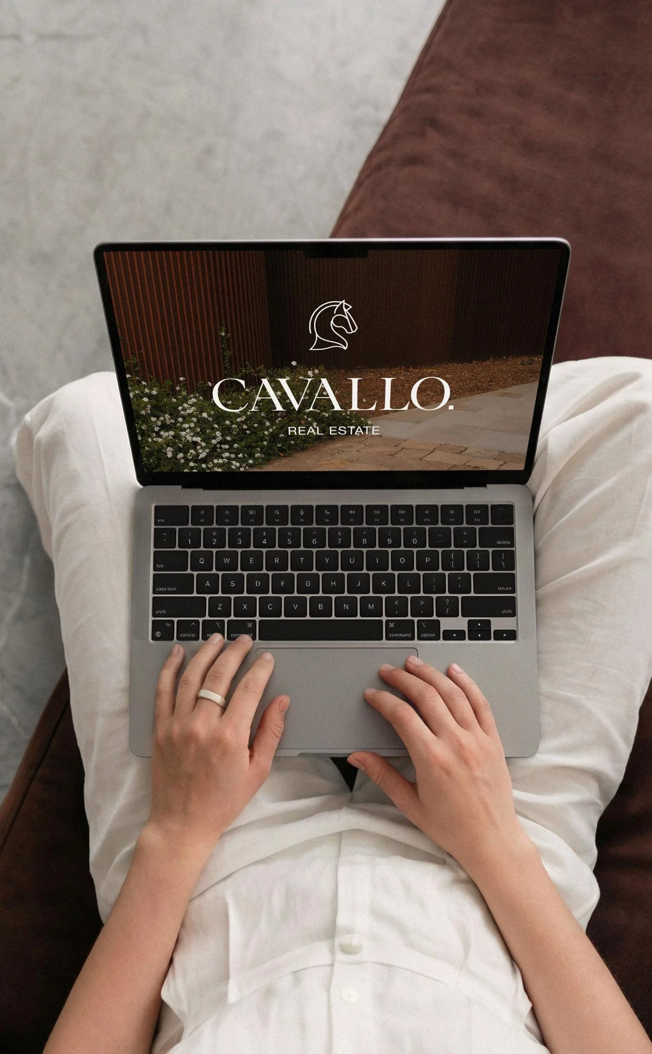
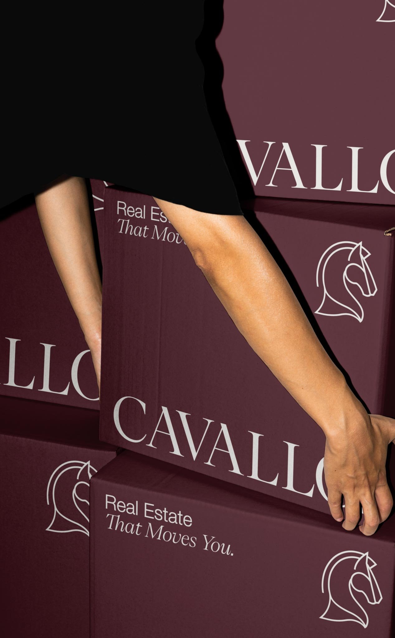
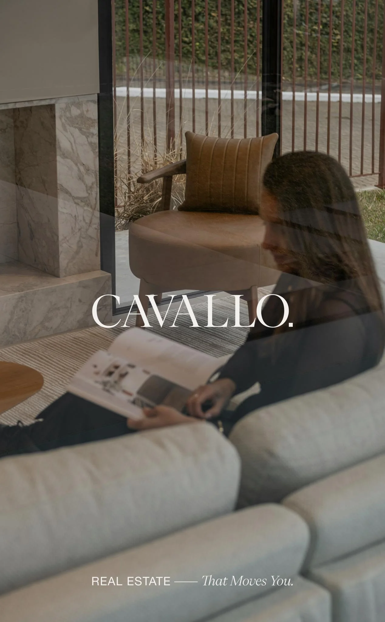
The finished identity pairs the distinctive Cavallo wordmark with a custom horse-inspired icon, supported by a deep garnet, wine, taupe, sand and ink palette and a typography system that balances expressive serif details with clean Helvetica Neue. I wanted the system to feel equally convincing on a property sign, a beautifully art-directed campaign or a simple digital touchpoint, giving Cavallo plenty of flexibility as the business grows.
The result feels like Cavallo itself: assured without being loud, polished without becoming corporate, and strong without losing warmth. It gives a new local agency its own visual territory in a market dominated by larger legacy brands, with enough personality to be memorable and enough restraint to let the properties and client experience lead. And yes, I am very ready to start spotting those Cavallo signs around Selwyn!